

Your Website Home Page Banner ... is it working for you?
Shops.
Remember them? Those places in town where you used to get stuff?
They had windows, displaying a selection of the goods for sale.
These visual showcases were always reckoned to be pretty important -
a vital part of enticing passers-by to drop in and browse ... and hopefully, spend.
They were like your Home Page banner.
Both need to be designed with care.
Both must be attractive.
Both must be relevant.
Remember - your banner serves one single purpose - to persuade your visitors to explore your wonderful website.
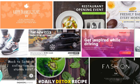
Sliding Banners - an annoying distraction?
Let's start with a quick digression. ‘Sliding banners’ or 'sliders'. Many websites use these - a series of images which take their place in the sun for a few seconds, before being unceremoniously elbowed to one side to make room for the next one. My view? I don’t like ‘em. They’re a distraction. Two reasons -
1. You’re studying the content of a banner, when ‘whoosh!’, it disappears, to be replaced by the next.
2. You’re trying to take in the text just below the banner when your eye is constantly distracted by the movement of the banner. Ever tried reading a book, with a moving image at the top of the page? Me neither, but you know what I mean.
Your job is to keep your visitor glued to your site - no distractions, no sideshows.
Your Home Page banner - the wording
Back to your banner - and its content. We'll skip the actual banner design. One of the many skills I lack is graphic design. Suffice to say, your banner should be attractive, relevant and a reflection of your company's brand. That's all common sense. But what about your banner's wording? Remember - this is your first opportunity to keep your visitor on your site and their first opportunity to leave.
So what does a good banner look like?
Should it be text-free? Just a nice, cool image with your company name? There’s a sound argument for this approach - especially if you’re a ‘designer’ brand, where the minimalist arty approach might be appropriate
A few well-chosen words
Banners like Trudie's are great but they won't work for every website. More often than not, a few well-chosen words will make all the difference in persuading your tentative website visitor to explore further.
Without filling the banner with clutter, you need to get across
- The benefits you deliver*
- Who you are
- What you do
- A Call To Action
* See how we've put the benefits first. Always, always benefits first. Those who know me will have heard me bang on about 'benefits first' more than almost any other topic (well, perhaps apart from the enduring sex-appeal of slightly balding, bespectacled copywriters.)
Here's an example of each of the four points above that an optician might use -
For a clearer, brighter future
EYES 4 YOU
Optician, dispensing glasses and contact lenses
![]()
Website banners and SEO
In the old days, banners (including the text) were just an image. The text wasn’t readable by the search engines. Not so now. You should make the words in your banner search engine friendly. If your geographical location matters, include it, like this -
For a clearer, brighter future
EYES 4 YOU
Solihull Optician, dispensing glasses and contact lenses
![]()
This banner text also includes other keywords - optician, glasses, contact lenses.
Don't be shy - show your phone number
(How else are you going to get a date?)
Have you noticed how some of the bigger companies (the utilities, for example) don’t want to hear from you? How do we know? They don’t display their phone number.
They’re an unfriendly lot. The last person they want to be spending time chatting to is you, unless of course, they’re a telephone bank. First Direct don’t only put their phone number at the top of their Home Page. They also slot in a neat little call-to-action too - ‘Contact Us’.

From the very start, these good people make it clear that they value you and they want to hear from you. My guess is that you want your customers to feel the same way about you and your company. Let's not hear that tired old excuse -
'Oh, if they want to phone us, they can always look for the Contact Us button!'
Now you're just being plain lazy! You should be giving your website visitor everything they need without demanding that they click around to find what they're looking for.
So - let’s see that phone number big and bold at the top right-hand corner of your web page. Demonstrate that you’re keen to hear from people - Shout loud and clear - ‘Open for business!’
So there we have it - how to make your website banners work for you.
More Copywriting Tips?
Is this blog helpful? Well, you reached the end, so it must have something going for it. The next one's going to be so much better.
To keep up, register here for the Copywriter Pro weekly newsletter.
Then you won't miss a single blog.
And if you do sign up ... you'll receive a free infographic featuring my top 15 copywriting tips.
Want to chat about your copywriting issues? Give me a call - +44(0)7703 472207.
Or you could book a discovery Zoom chat below.
Till the next time ...
